Friday, November 2, 2018

Pop art

We began the pop art project by taking pictures of our partner. After choosing an ideal spot in the courtyard, I took several shots of my partner, Ava, and then uploaded the best into photoshop to begin the editing process. After studying the picture, I added a filter over Ava's body. This gave it some cool texture that really contributed to the overall "pop art" look. Next, I colored each individual brick on the brick wall background different colors. This pop of color really spoke for itself when it came to being pop art.  

Going into this project, I didn't have any initial design ideas or color scheme ideas. I liked pink and orange so I did end up incorporating them into my work but that was my only idea. I ended up using many bright colors such as pink, orange, and bright blue. 


My work was probably inspired most by Roy Liechtenstein's work. He used dots and bright colors to show simplicity and yet, also complexity at the same time which was what I was going for. 

This was a very interesting and new type of project. I had to use different techniques then what I enjoy and am used to using. I learned a lot throughout this experience and project. Filters now are easily located when I need one and there are so many different brushes that I can use. This was a very cool project and helped me broaden my comfort zone.

Monday, October 22, 2018

Multi-Exposure Panorama

I take a deep breath as I step onto the plane. Nine hours and I will be in Brazil. I've been planning for this trip for a month and it was finally here! I had made sure to pack all the necessities including swim suites and dinner outfits. Shortly after boarding, I feel the familiar rumbling of the engine and the pilot begins his usual pre-flight speech. I sit back in my seat and turn on my music, trying to relax as I know this will be a very long flight. I feel myself drifting off, just as the plane takes flight, getting transported into dream mode. After a strange dream about being chased by burgers, I wake up to find the beautiful country of Brazil smiling up at me from the ground. The rolling hills, the busy street, I could almost smell it already.


We had a full day ahead of us after we checked into our hotel at 8:30 am. What's a better way to spend it then right across the street to the beach? The moment I stepped outside I could smell the  salty air that I hadn't smelled in so long. A cool breeze lifted my hair up off my shoulders as my family and I walked across the bustling streets. My got our chairs that the hotel provided us and my sister and I tore off towards the water. Oh how I've missed that feeling of the sand between my toes! I jumped into the ocean and started swimming out. I tasted the salty water as I dove under, feeling seaweed tickle my leg and the sea shells crunching under my feet. Five times, I got knocked over by the monstrous waves but each time coming up laughing. This was glorious! Then, we ventured into the heart of Rio where I got to get up close and personal with three popular sights; Sugarloaf mountain, Christ the Redeemer, and Escadaria Selarón, the popular steps. Along the way, I got to witness the incredibly amazing, but also dangerous, Favelas, named due to the fact that when the poor people of Rio were offered no government aid, they had to build their own communities. The land they chose to build on, which was up a mountain,  was covered with favela trees. The name stuck and even today these civilizations are still called the favelas. After the tour, we went on a helicopter ride in which I got  to fly over Christ the Redeemer and Copacabana beach, the view was breathtaking and I loved the thrill of being in a helicopter.  
After hours of playing in the waves and relaxing on the shore, my family headed down the beach in search of lunch. Luckily, we happened to be near one of my parents favorite seafood restaurants so were more then happen to drop in and eat some food. We ordered fried jumbo-shrimp, garlic shrimp, and my picky sister got a burger. As I bit into the shrimp, a rich, buttery taste filled my mouth. Yum! All of the food was fantastic, even my sisters burger, just as my parents had said it would be.
I ended up really loving my finished product. It was so fun to make and the pictures all seemed to be in favor when it came to fitting together. I spent a lot of time blending the pictures together so it looked natural and all like one continuous image. I blended several buildings together and I also blended the favelas image with the helicopter view image. All in all this project was fun, exciting, and turned out great!


Tuesday, October 16, 2018

Printing Processes


Relief

Relief printing is where you cut away at a surface, creating an image from the raised area.  The process is quite simple, first you draw directly onto some kind of surface such as a wood block. Then, you cut away all that you have drawn, the actual lines will be white and the empty space will be inked. Next, you coat the surface in ink with a roller. Lastly, place a piece of paper over the block and apply pressure so the ink transfer onto the paper.  Let the ink dry, and the process is complete!

Intaglio

Intaglio printing process is where the image area is below the flat surface, meaning the cut out part. Two different types of intaglio are dry point and etching. The first step in this process is to start by polishing and cleaning your surface so nothing obstructs your work. You also need to add a ground which protects the white parts of the image. You then smoke the plate until the surface black. Next, you scratch away the ground on the plate to reveal the metal surface on which you are working underneath it, these scratches will be the black part of your image, because the ink settles into it. Next you etch the plate, which eliminates all bare metal areas on the plate. Next you clean the plate, removing the ground. You then apply ink to the surface and clean away all the extra. Lastly, you place a sheet of wet paper on top of the plate which you send through the printing press, finally revealing the finished product.

Lithography

The lithography process is made up entirely of how water and grease resist each other. You start by using a pencil specific to this process called a "lithographic pencil" to draw your image on stone. You apply gum arabic and TAPEM to the stone, then begin etching it. After that, you reapply the gum arabic, a process called cooling the stone. You then use a cloth to make the stone absorb the chemicals.  Next, use lithotine to wash your drawing, this will cause it to seemingly disappear, creating a "ghost image". Now you add on asphaltum then go over the image with a wet towel, dry towel, then sponge. Follow with applying ink immediately to the surface, making the image appear. Put a piece of paper on top of the stone and press the ink further into the stone. Lastly, put a dampened piece of paper on the stone and press the image on the paper.

Conclusion

I would like to try relief print making sometime because it seems to be fun, relaxed, and made the most sense to me. This older methods helped give current artists a base to build off of and grow from.


Monday, October 15, 2018

Coding Challenges and Process

So far, this year in web design the biggest challenge I have faced would be on the very first assignment when I didn't even know what HTML meant. I had absolutely no idea what to do, despite having intricate explanations and a step by step tutorial to follow. After the first one or two projects though, I began to develop a basic understanding of how to code, with a lot of help of course. Now, I can do nearly all of each project completely on my own. I would definitely say that I overcame those challenges. Coding becomes much easier when you know what a "tag" is. 

I was most surprised by the fact that I wasn't very behind in relation to rest of the class. Naturally, there were several people who had a very advanced understanding in HTML and CSS but most of class had little to no experience which made me feel more welcome and comfortable. So far, my favorite thing about coding is simply being able to type seemingly nonsensical things into the computer but then ending up creating something that I never thought I could do. I have learned so much even just in this first quarter but nothing compares to the proud feeling I get when I can figure out what I did wrong and fix it all on my own. I can't choose a specific thing to further explore, as I would like to enhance my knowledge in everything we have covered so far. Although I found a lot of interest in using the hexadecimal code of a color to change the text color of my writing.  

Wednesday, September 19, 2018

Photoshop Challenge (Nature Man)

Original Ideas to the finished product

From the very beginning I knew I wanted to use trees for the man's hair. I have seen some really cool photo manipulations with trees for hair, that looks so natural since they have the same general shaping. I also knew from the beginning that I wanted to change his jacket in some way, making it some kind of root or dirt. For the most part, my idea stayed the same. The end product wasn't exactly what I pictured but I was still happy with it.

Blending Modes, Masks, and Adjustment Layers

For Blending Mode, I increased the saturation to give the picture a more vivid look. The more saturated look makes the picture overall look better and more realistic. I used a Mask on the hair, jacket, and undershirt. I placed the photo on top of what I was wanted to mask and then I turned the opacity down a lot so I could easily see the under image. Next I used the Selection Tool to select the part of the top image I wanted. For example, on the tree image, I selected the part where his hair was directly under and then made a Mask out of it. For Adjustment Layers, I increased the brightness level slightly to give it a more pleasant and happy look. 

The turn out 

My project ended up being slightly different then my original idea. I'm not entirely sure what I was going for initially but I do know that It was different. That being said, the difference doesn't mean that I was less then satisfied with my end result, in fact, I was quite pleased with how it turned out. I was definitely surprised that it ended up being so similar.


Wednesday, September 5, 2018

Basic Photo Editing


For our first project in graphic design this year, we did a series of Adobe Photoshop tutorials. We learned several very helpful things and I learned to use some of the tools in ways I never knew I could. Tools such as Content Aware Fill and Clone Stamp were essential in the editing and making of these photos.


Content Aware Fill

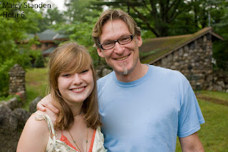
Content Aware Fill is used to remove unwanted elements from images. By simply selecting an area of a photo, this tool makes the area blend in better. For example, The picture on the left previously had a rather unattractive graphic on the father's shirt, but using Content Aware Fill, I changed the shirt to be entirely blue. This was a fairly easy tool to to work with and it has great results.


The Patch Tool

The Patch Tool is another easy and important tool we used. This tool is primarily used to fix large areas of an image or get rid of unwanted blemishes. The picture to the right previously had a hook and many black smudges and spots on the wall but using The Patch Tool I easily removed them. This tool is very similar to Content Aware Fill, except it is more precise.


The Clone Stamp

The Clone Stamp is used to remove dirt, pimples, or any imperfections from things such as faces. It takes a sample from another part of the face and uses that to cover up the said thing you are trying to remove. The picture to the left originally had dirt and many spots on his face, but using this tool, I removed them and the results were quite natural. 


Healing Brush Tool and Spot Healing Brush


The Healing Brush Tool allows you to fix image imperfections such as scratches and blemishes. By sampling the surrounding area you can blend the imperfections into the rest of the image.

Spot Healing Brush is an easy, but lifesaving tool.You simply click on the blemishes you want to get rid of (or drag with the tool to paint over the larger areas you wish to repair) and the spot healing brush works out the rest for you.


Portrait Collage

This was by far the hardest as the tasks. I struggled to make the pictures blend together and look good. Making a portrait collage took all of the tools and immense patience and focus. I used Content Aware Fill, Patch Tool, Clone Stamp Tool, Healing Brush Tool, and Spot Healing Brush.


All of these skills I learned during the Photoshop tutorials will be extremely useful and important in any future I may have of graphic design. Going into these projects, I had no idea how to use the different tools in Photoshop. This definitely made certain parts of these projects pretty difficult. The first few were pretty easy and I didn't have any problems. However, after doing the harder projects at the end, I feel I could have redone a few of the earlier ones so they could look more professional.While most of these were all pretty easy to understand and produce, the portrait collage was a major bump in the road. This one was extremely detailed and complicated and I struggled with blending them all together. I also had trouble with the little boy's face because I couldn't get the clone stamp to work properly.

All in all, I am very pleased with my work. Although I had some hardships along the way, It ended up being a great learning experience and I can't wait to put forth these skills in projects outside of class.


Wednesday, August 22, 2018

Wayback Machine Comparison Excercise


2005 vs 2018 YouTube website 

  1.  The most obvious difference between the 2005 and 2018 YouTube websites would be the the overall set up. The new website utilizes the entire screen while the old one only uses the center.
  2. The next most obvious difference is the color scheme. The new website is a white background with red accents. The old one however, has multiple colors including; grey, tan, light blue, dark blue, orange, light orange, and the red from the logo.
  3. Another difference is that the new website has a sidebar on the left which has a lot of links including; Home, Trending, and History. The older website has these tabs as well, but they are located at the top of the page and don't have nearly as many. 
  4. The logo has changed within the last thirteen years from the "Tube" part being enveloped in the red to now there is a red play button in front of the words "YouTube".
  5. On the old web page, you would rate videos on a scale of 1-5, but now, if you like the video, you give it a "thumbs up". 
  6. The old YouTube was not for the vlogging, DIY, and prank videos that it is for now. It was much less diverse in video content and was more for tutorials on dancing and cooking, which it is still used for today but with added topics and ideas.

Wayback uses in web design

Wayback can be very useful in web design, especially when redoing/ changing an already existing website. Using elements from the previously created website, you can modernize and improve it. You can also learn from the mistakes of an old website and avoid the elements that were unflattering or unimpressive. This helps to create brand new and fresh ideas that help web pages be attractive and take in views. The last important thing that Wayback Machine can do is that can help to stop us from unintentionally copying ideas and looks from old websites. Using the same ideas that have already previously been established takes away from the uniqueness of each individual website.  

second semester video

Happy Campers This project consisted of writing, casting, and filming our own short film. There was a lot of time and effort put into t...