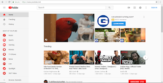
2005 vs 2018 YouTube website
- The most obvious difference between the 2005 and 2018 YouTube websites would be the the overall set up. The new website utilizes the entire screen while the old one only uses the center.
- The next most obvious difference is the color scheme. The new website is a white background with red accents. The old one however, has multiple colors including; grey, tan, light blue, dark blue, orange, light orange, and the red from the logo.
- Another difference is that the new website has a sidebar on the left which has a lot of links including; Home, Trending, and History. The older website has these tabs as well, but they are located at the top of the page and don't have nearly as many.
- The logo has changed within the last thirteen years from the "Tube" part being enveloped in the red to now there is a red play button in front of the words "YouTube".
- On the old web page, you would rate videos on a scale of 1-5, but now, if you like the video, you give it a "thumbs up".
- The old YouTube was not for the vlogging, DIY, and prank videos that it is for now. It was much less diverse in video content and was more for tutorials on dancing and cooking, which it is still used for today but with added topics and ideas.

Wayback uses in web design
Wayback can be very useful in web design, especially when redoing/ changing an already existing website. Using elements from the previously created website, you can modernize and improve it. You can also learn from the mistakes of an old website and avoid the elements that were unflattering or unimpressive. This helps to create brand new and fresh ideas that help web pages be attractive and take in views. The last important thing that Wayback Machine can do is that can help to stop us from unintentionally copying ideas and looks from old websites. Using the same ideas that have already previously been established takes away from the uniqueness of each individual website.


No comments:
Post a Comment